How Form Works / Big Medium Small
July, 2026
In the book Elements of Design, Gail Greet Hannah illustrates a design methodology developed by Rowena Reed Kostellow, a professor and pioneering design educator at Parsons School of Design during the mid-century. The sequence of exercises is especially focused on understanding and handling 3D form. One of the most famous starts with a composition using three rectilinear forms of different degrees of presence. The exercise is meant to teach how form works through the ideas of dominant, subdominant, and subordinate elements. The larger point is that when form is organized in a way that communicates clearly, the viewer can read it on multiple levels: as attractive, as functional, and sometimes even as something that invites narrative.
Students are asked to arrange three volumes, usually box-like forms of different scale and proportion, so that each one plays a distinct role in the hierarchy. The dominant element is the largest and most visually significant form. It anchors the composition and gives it character. The subdominant form is medium-sized and secondary. It supports the dominant while adding complexity and tension. The subordinate form is the smallest and least visually forceful. It acts like punctuation, helping complete the composition and sharpen the hierarchy. Students typically build these studies in simple materials like foam, clay, or wood, and the point is to test how small changes in scale or placement alter the reading of the whole. The constraints are part of the lesson. Only rectilinear forms, only 90-degree angles, only matte white surfaces. The restriction is deliberate. It removes the noise and puts the emphasis on formal relationship.
example of the Dominant, Subdominant, Subordinate exercise
This exercise is valuable because it teaches more than proportion. It teaches hierarchy, spatial interaction, and the idea that design is not just about making one object look good, but about organizing attention. This exercise has been part of foundational industrial design curriculum for decades, and it still appears in many variations today. But I think there is more in Rowena’s framework than just a basic form exercise. It is actually a way to think about design strategy itself. The simple three-part structure can be expanded into a more flexible language for understanding a product as a whole. I prefer to call the three levels big, medium, and small. That language is less technical, easier to move across different kinds of projects, and better suited for thinking about design as a strategic framework rather than only a formal one.
Let’s begin with a simple idea. The big is whatever element defines the overall presence of the design. The medium is the next layer down, smaller than the big but still highly visible and important. The small is where the details live. That might sound obvious, but once you start using it intentionally, it becomes a useful way to sort what actually matters in a project. An elephant is a good example. The big is the iconic silhouette of the animal, the mass, the overall anatomy. The medium is the thickness of the trunk and legs, the scale of the head, perhaps the way the body moves in space. The small is the texture of the skin, the eyes, the wrinkles, the subtle things that make the animal feel alive. The same logic works for plants, buildings, cars, shoes, or cameras.
Quantity of formal elements: Franck Muller Aeternitas Mega Deviation from Tradition: Cartier Crash
While the former is a simple concept oriented around quantity of geometric/visual information such as complexity of shapes and intensity of color, the latter may need a little explanation: A circle shaped book is a radical departure from a rectangular shaped book from a tradition of publication, even though it remains a very basic shape, hence warranting a high dynamic score in the context of book designs. Cartier Crash, is another example of design with high degree of visual/geometric deviation from what would be considered a normal watch shape. This also leads into an important reason for studying the history of the products and its adjacency which a designer (student) is working on. Knowing what has been, allows one to be able to propose exactly what is new and how to manage it within the complexity of the design.
It’s important to understand this action of emphasis in specific and granularized manner, and to handle it in its localized place. Such emphasis can live in different levels of big, medium, small. A radical change in the big will immediately impact the initial perception of an object, while a subtler design might leave the big alone and put the energy into more subtle layers such as materials, details, interfaces, or long-term use. As a designer, the question is not simply “what is new?” but “where is the newness placed?”
This is where I think a lot of student work goes wrong. The newness is often forced into the big. It is almost always treated as a silhouette problem. You can see this in pages and pages of thumbnail sketches where every possible geometric outline of a new product is explored, as if novelty only lives in the outer boundary. But that kind of energy can get used up too early. Sometimes the silhouette should stay relatively familiar so the more interesting things can happen later, in material, proportion, feel, or interaction.
The key idea is to handle this dynamic continuously as a design parameter. Good designers intentionally pull the emphasis away from the initial charm of the silhouette and put it into the medium and small. Dieter Rams and the Braun tradition are often a good example of this. So are a lot of Apple products at their best: the shape may be restrained, but the material choice, the edges, the interface feel, and the long-term experience carry the design argument. In those cases, the product is not boring. It is simply not trying to get its meaning all at once. Meanwhile, some designers purposefully place the big idea in the ‘big’ in order to impress early and be conspicuous.
FIG. 1 / Big-Medium-Small design elements
This kind of spectral categorization becomes especially useful because it reminds the designer that all of these elements are part of the toolset. However, shape, scale, proportion, material, color, texture, layout, interaction, feature set, tactility, and weight do not all engage at the same time or distance from the user. Some are grasped immediately. Others matter only
after use. That means a designer has to think not only about what is being designed, but when it is being understood. In that sense, design is about placing these elements in an intentional sequence to strategically guide a particular user experience.
A product experience usually unfolds in stages. First, there is encounter: you see the product and register its silhouette, gesture, or overall presence. Then there is operate: you move closer, touch it, and begin to use it in a basic way. Finally, you relate: the product becomes something you know more deeply through time, repetition, and use. These stages line up well with the big-medium-small spectrum. The big tends to dominate encounter. The medium often matters most in operate. The small can become meaningful in ways users relate with the object.
The important thing here is proximity. Visual, tactile, and relational experience are not the same thing, and they do not happen all at once. That is why it is possible for a product to be visually quiet and still deeply satisfying, or visually loud and quickly exhausting. Then what does it mean to be ‘loud’ or ‘more’ or ‘quiet’ or ‘less’? If we understand this framework of big-medium-small as a tool to perceive and control the dynamic of form within a user experience context, the magnitude within this dynamic paradigm manifests through two different types of actions: degree of deviation from basic form and degree of deviation from tradition. in other words, the quantity or amount of visual activity, and distance from historical and cultural familiarity.
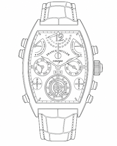
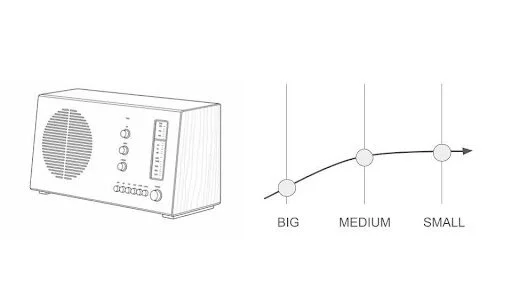
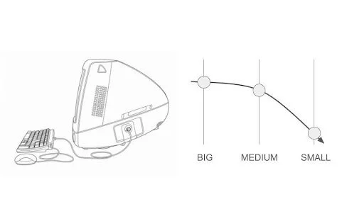
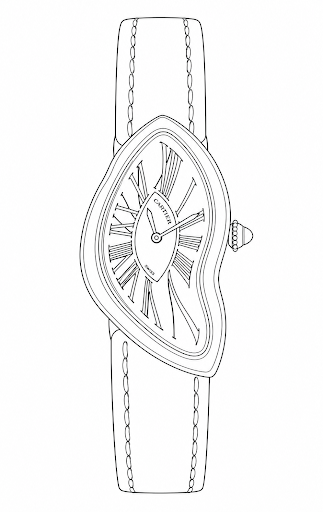
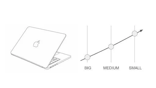
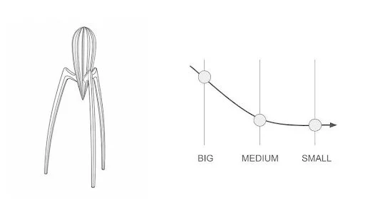
FIG2: visual dynamics of famous industrial designs:
The Mid-century Italian design maestro Achille Castignioni’s famous concept of the primary design component, is useful to reference here because it reinforces the same idea: not every element needs equal weight. A design can have one central point of emphasis while the other design features exist to support the primary element. That point of emphasis does not have to be the silhouette. It can be a control surface, a transition, a material seam, a surface treatment, or even a behavioral detail. The job of the designer is to decide where the strongest idea belongs.
That is why contemporary products are often more complex than the products of the past, even when they look simpler. Design has shifted from merely producing a visually strong object to producing a meaningful experience. A sofa does not need to shout anymore. It needs to fit. A premium product is often less extravagant and more understated, but that understatement can carry more confidence. You can see that difference if you compare something like a Vertu phone to an iPhone. One tries to announce status through surface drama. The other lets the design work through restraint, usability, and connected ecosystem.
The big-medium-small framework becomes a practical way to be intentional with the design emphasis. You can place more in the big if you want a new archetype. You can place it in the medium if you want a product that feels fresh without losing familiarity. You can place it in the small if you want depth, subtlety, and long-term satisfaction. And then, the secondary elements’ job is to support the lead, hopefully in interesting way and in appropriate amplitude.
That is also why the framework is useful during research. When you are collecting references, testing ideas, or building a moodboard, it helps to think about what kinds of features align with each other. A milled aluminum body, a smooth turning knob, and a bead-blasted surface may all belong to the same design argument because they reinforce the same kind of experience. You can do the same with automotive design, furniture, consumer electronics, or tools. The point is to choose what should be loud, what should be supportive, and what should stay subtle.
In the end, the strongest lesson in Rowena Reed Kostellow’s exercise is not just how to arrange three blocks. It is how to think about form as a hierarchy of meaning. Big gives the object its first read. Medium gives it structure and relationship. Small gives it nuance and memory. Once you understand that, design stops being a matter of simply adding more. It becomes a game of placing attention where it belongs..